MindTech Guru
Building a high-fidelity prototype of a key user flow in a B2B platform delivering personalized mental wellness solutions to employees.
DURATION: 4 weeks
ROLE: Team lead and IC for a remote design team of two
SCOPE: Persona Creation, High-Fidelity Prototyping, Usability Testing, Visual Design
Company Overview
Mindtech Guru (MTG) assists employees in finding the right mental health solutions by providing a specialized questionnaire and a curated collection of tools tailored to their specific mental health and wellness challenges. It also offers information on whether these solutions can be covered by health and insurance benefits.
Project Impact
Proto-persona creation for increased empathy and targeted design solutions in future iterations
Providing design solutions for key screens in the questionnaire flow that needed to be optimized for mobile before beta launch and testing
Conducting initial user testing before beta launch

L A Y I N G T H E G R O U N D W O R K
Before we began, the client had sent us some background material on the project, as well as their desired goals. During the kick-off meeting, we confirmed alignment between the design team and client on the project scope and deliverables:
D I V I N G I N T O R E S E A R C H
In order to better understand the product and market landscape, we reviewed the existing research, which included some competitive analysis, as well as a design audit of the existing questionnaire flow by the previous design team.
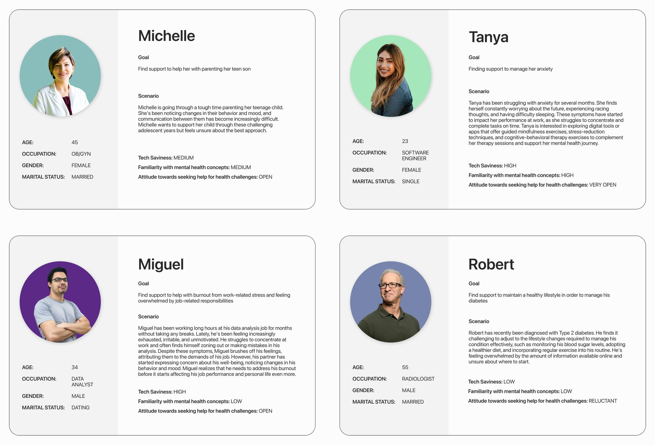
However, I realized that there was a missing link in terms of documentation when it came to how UI/UX decisions were made. I thought it might be useful to develop proto-personas as a tangible place to direct stakeholders when making future design decisions. The client agreed, and based on client input and additional research — we developed four proto-personas with an emphasis on their story (as written in the scenario section):
Proto-personas
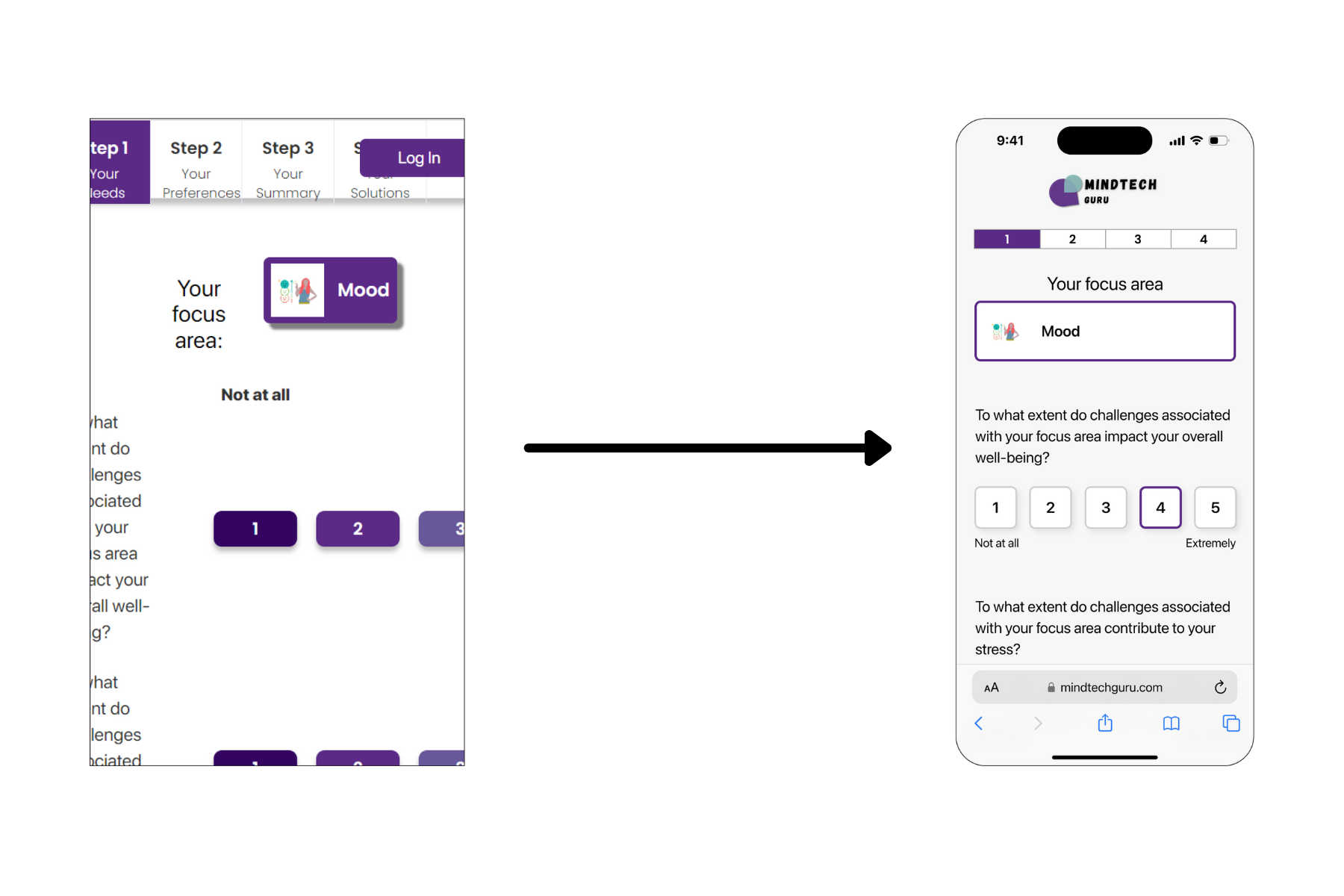
Next, I delegated specific UI elements and corresponding screens that needed to be designed and optimized for the mobile web version of the questionnaire flow. I focused on the impact scale and progress tracker, conducting research and ideating potential solutions, while my partner worked on pop-ups and the search results screen.
For each UI element, I walked the client through my notes of the existing elements, sourced and shared examples from other websites for inspiration, as well as incorporated client suggestions and feedback before landing on a final design.
One challenge was that we had to work off of screenshots, since the questionnaire flow was only available on the client’s local server, which meant we had to be meticulous in asking follow-up questions about details such as the UI of interactive states.
1. Impact Scale
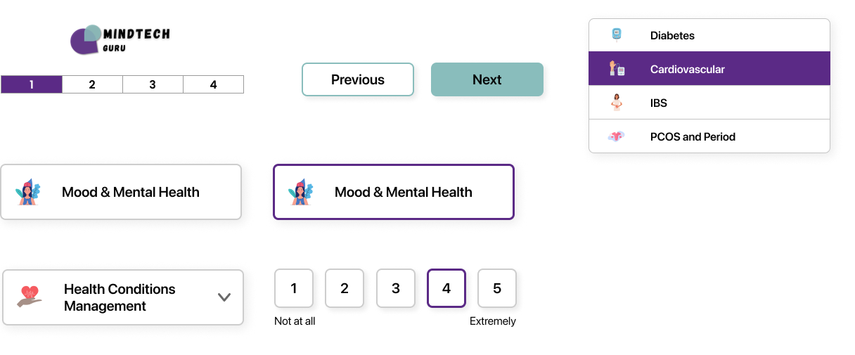
UI Elements
2. Progress Tracker

C R A F T I N G T H E E X P E R I E N C E
After conferring with the client, I was able to finalize the relevant UI elements and screens. One of the driving factors behind the design decisions was simplicity, since the client’s priority was preparing the questionnaire flow ASAP for the beta launch. However, as we built trust with the client — they started asking for design feedback and updates on several other key screens, which I provided.
Updated impact scale screen also showing the progress tracker in context
Additional design update: Updated summary of preferences with more consistency in visual design with other screens in the flow
Additional design update: New selected state (purple border) avoids issue of awkward-looking white square that surrounded the illustration in the previous selected state (purple highlight)
Style Guide/UI Element Library
Color Palette
SF Pro Display Typography
UI Elements (Desktop)
UI Elements (Mobile)
I also realized that the previous design team had not built a style guide, so I decided to create a simple one with an UI element library that the client could share with future collaborators as I progressed through the high-fidelity design.
High-Fidelity Design (Desktop Web)
The client also wanted Figma files for the desktop version, which we created — for some screens, the client asked to integrate the designs that we optimized and updated for mobile back into the desktop web version.
BEFORE:
AFTER:
High-Fidelity Design (Mobile Web)
G A T H E R I N G U S E R I N S I G H T S
Usability Testing
Next, we recruited five participants to conduct remote usability testing for the questionnaire flow to identify any issues in the primary red route and uncover other potential opportunities for improvement.
The inquiries that guided us were:
1. Could users successfully complete the questionnaire? (i.e. were they empowered to achieve their high-level goal?)
2. What did they think of the content of the questionnaire?
3. What did they think of the results page? Did they have enough information to select a relevant solution?
4. What general opinions did they have on the UI? (desirability)
High-level, we discovered that:
🤔 40% users needed help in finding the navigational buttons to move forward in the questionnaire on the second screen
🤔 Users thought the questionnaire was thorough but struggled to understand a couple of the questions
😊 Users thought the results page was comprehensive and appreciated the information on insurance coverage and cost
😊 Users liked that the health-focused app had a casual and clear visual feel that wasn’t clinical
For our first 🤔 finding on users struggling to find the navigational buttons on the second screen (where they were located below the fold), we recommended that the client monitor this issue in their beta launch. One solution we had considered was making the navigational buttons sticky at the bottom of the site, but since it wasn’t a common UI pattern for mobile web, we decided it would be wisest if they gathered more data before implementing a potential change.
For our second 🤔 finding where users struggled to comprehend some of the questions, we recommended specific wording changes, like updating “Are you interested in any of these specialized paths?” to “Do you want to prioritize solutions that target/focus on…” where the answers were: Women, BIPOC, LGBTQ+, and None.
Recommendations for the Client
We also supported the client in preparing for the next phase of the project (beta launch and testing) by presenting our findings and recommendations. A couple of standout recommendations are noted below.
While our prototype of the questionnaire flow wasn’t set up to test the 40+ options within the four parent categories, we had enough user feedback to suspect that users being able to find their desired option might pose a challenge.
We recommended that the client conduct a card sorting exercise if users struggled to find their desired option in the beta launch.
On the results screen (designed by my partner), users commented:
They wanted the ability to identify what type of tool (e.g. podcast, app) each result was, as well as filter the results by tool
They weren’t sure how to interpret cost (was it per subscription? session? something else?)
They weren’t sure what would show up if they selected “Click to Find Your Insurance”
We recommended:
To add a tag under “Features” with the tool type and to add a filte
To clarify that the cost would be per month (which was a data point already available on the back end)
To update the language to “Check If Insurance Coverage is Available” for clarification

R E F L E C T I O N S
This project gave me an opportunity to leverage my skills in client communication and project management, as well as practice adaptability since we had to adjust from a team of three to a two-person design duo when a member dropped out unexpectedly 20% through the project.
This experience also pushed me to hone my skills in explaining the value of the design process as well as the rationale behind every design decision in order to build trust with the client. I felt like this was achieved when the client became open to expanding the initial scope of the project from designing a couple of screens to creating prototypes for the entire questionnaire flow for both mobile and web, conducting usability testing, and also asking for suggestions on how to adapt the design for tablet screens.
Many thanks to MindTech Guru for trusting us with this process and to my great design partner, Katie Moeller.


