
Foundation for Intentional Community
Enhancing the homepage and community search experience for 440K+ users

DURATION: 3 months
ROLE: IC for UX strategy/UI design

O V E R V I E W
About the Client
Project Objectives
The Foundation for Intentional Community (FIC) is a nonprofit that has been supporting communities since 1987.
FIC helps people find or build intentional communities—places where people live together with a shared purpose, whether in cohousing, ecovillages, or cooperative groups. Their mission is to promote social, ecological, and economic justice through these communities.
FIC offers resources such as a global community directory and courses to make communal living more accessible.
FIC engaged with our team in order to improve the usability of their website for four target personas that had been identified in a previous research phase.
Their goals were to:

Strengthen FIC’s brand identity to maintain their position as a leading authority in the intentional communities field.

Connect users with intentional communities that fit their needs.

Keep users in the early stages of their engagement funnel engaged with the website since they brought in key revenue through purchases (e.g. courses, books).
U N D E R S T A N D
Personas


We conducted a customer experience workshop with participants from the cross-functional FIC team, which included designers, researchers, marketers, developers, and a user in order to:
Integrate prior user research
Clarify user needs and pain points
Clarify the client’s business priorities
For each persona, the team crowdsourced our understanding of:
User goals, motivations, and tasks
What we thought users expected to see, learn, and do on the website
How we could support users through each step of the engagement funnel (from awareness to conversion to loyalty)
Figjam excerpts from the Customer Experience Workshop ⬇️
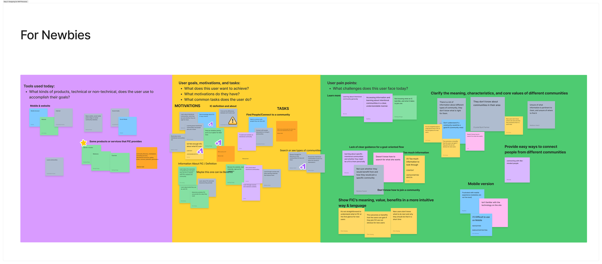


We compiled the information we collected through the customer experience workshop into a report, and as a result, we were able to:
Prioritize key user segments (Newbie & Seeker) and identify their high-level goals while maintaining a focus on business priorities
Analyze pain points and ideate potential ways to improve the current user experience

To dig deeper into the first point above, we focused our efforts on designing for the Newbie & Seeker personas — while they exhibit different behaviors and are different user segments, one can also think of the Seeker as someone who is deeper into their journey engaging with FIC.

The Newbie’s main goals are to:
Gain an understanding of intentional communities
Gain an understanding of FIC’s mission and work (they’re thinking: “what value can FIC provide to me?”)
We converted the goals into related user stories:
As a Newbie, I want to understand who FIC is and what they do when I first visit their website so I can understand whether they can provide value to me
As a Newbie, I want to gain an understanding of intentional communities so I can determine whether it’s the right type of living situation for me
The Seeker’s main goal is to:
Find an intentional community that fits their needs and values
which we then converted into a related user story:
As a Seeker, I want visibility into community specifics so I can determine which intentional community fits my needs and values
The customer experience workshop also helped resurface pain points that had been uncovered in prior research, such as:
Users’ inability to determine the trustworthiness of FIC due to unpolished and inconsistent visual design on the website
Cognitive overload from lack of prioritization of web content
Difficulty navigating the website to find the information they’re looking for

Analytics on key pages also revealed low engagement rates and high bounce rates, especially from the Advance Search page of the Communities Directory.
Based on the insights from the customer experience workshop, our team decided to focus on improving:

The homepage

Search flow for the Community Directory
We also aligned on this decision by plotting opportunities within a prioritization matrix, where we visualized the sweet spot between effort and ROI.
Define a clear project scope to provide maximum client value in the first phase of our work together

Customer Experience Workshop

User Goals & Stories
Pain Points
Prioritization & Scoping

Prior work by the research team at FIC included the creation of four personas to help focus future design decisions.
C R A F T I N G T H E E X P E R I E N C E
Information Architecture
We first had to address the website’s sitemap and content framework in order to ensure that the subsequent flows we created mapped correctly onto the information architecture of the website.
We also needed to better understand how different content on the website would be categorized. That would allow us to then group and prioritize it appropriately on the homepage since not all users scrolled to the bottom of the page.
Therefore, the team conducted a quick but thorough content audit to group relevant content, remove redundancies, and subsequently help users navigate the website more effectively overall.

This exercise then informed us on how to create an effective sitemap that would help users better find the information they were looking for. Below, you can see the high-level visual sitemap for ic.org:

The proposed sitemap was shared with the research team to conduct a card sorting exercise in parallel to validate our proposed solution.
With clarity on persona prioritization, high-level user goals, and how content would be organized overall on the website, we then proposed an updated homepage design, which I’ve annotated below.

Community Directory Search Experience
PROBLEM

Next, we focused on the Seeker’s key goal to find an intentional community that fits their needs by crafting a user flow:

We were able to identify 4 opportunities in the flow to enhance the user experience:
Each of the designs below were finalized with input from the client, including the developer, in order to check for compatibility and feasibility with the Voxel platform they planned to transition their Community Directory to.
PROBLEM
The existing prompt for the Community Directory search bar was too broad (“For example, try ‘California’ or ‘Cohousing’…), which led to users’ over-reliance on a complex filter system to narrow down on search results.
SOLUTION
We created a dual search bar with clear prompts in the input fields (“Search by location” + “Search by keyword”) to help users with their initial search. We chose location because it was the most popular filter, with over 50% of users utilizing it to narrow down search results.

2. Search results filters
PROBLEM
The existing filter functionality had 40+ uncategorized filters to refine community search results, which led to cognitive overwhelm.
SOLUTION
Our team reviewed the filters and related analytics in order to:
Clean up existing filters (clarify filter names & remove filters with low usage rates)
Make popular filters accessible on the search results page
Create groupings for easier filter navigation

Popular filters are easily accessible from the search results page

All filters were grouped into categories to help users find the ones they’re looking for
3. Identifying relevant community listings
PROBLEM
Users struggled to identify listings that fit their needs since search results lacked visual hierarchy and geographic context
4. Community listing page
Users felt overwhelmed by the dense content on the community listing page, especially on mobile, where long scroll lengths made it difficult to find relevant information.
SOLUTION
We designed updated community listing cards that were easily scannable but still retained key information that would help users determine whether a community was a good match.
This information was based off of analytics on highly-used filters, while balancing client requests — such as FIC’s desire to indicate whether a community was an “FIC Member.”
We also created the option for users to view their community search results in a split view with a map.

SOLUTION
We reorganized content to mirror existing filter categories and introduced a sticky tab navigation, allowing users to jump between sections without excessive scrolling. To improve scannability, we also collapsed longer text blocks with a “Read more” option.

We then shared this information with the UX writing team so they could start to get a sense of what type of content they would need to start drafting to fill in any gaps.
Homepage
1. Initial search input fields
W H A T C O M E S N E X T
Continued UI Refinement
There are still some final elements of the community listing page that need to be finalized, as well as the need to define the states of some interactive elements in the community search flow (e.g. input fields) to account for various user interactions.

Usability Testing
We’ll need to continue collaborating with the research team to validate the new sitemap as well as the community search flow to ensure that our solutions are truly user-friendly.

Onto Phase 2…
We found that within a three-month project period, our team was able to create designs for one flow (four pages with many interactions). For the next phase, we plan to focus on the "purchasing FIC resources” flow to support their financial sustainability.